AndroidCompose使用Dialog
2022/8/10大约 1 分钟
基于Compose实现的基本提示对话框和耗时进度对话框。
全部代码见GithubShanyaliux/ComposeDemo (github.com)
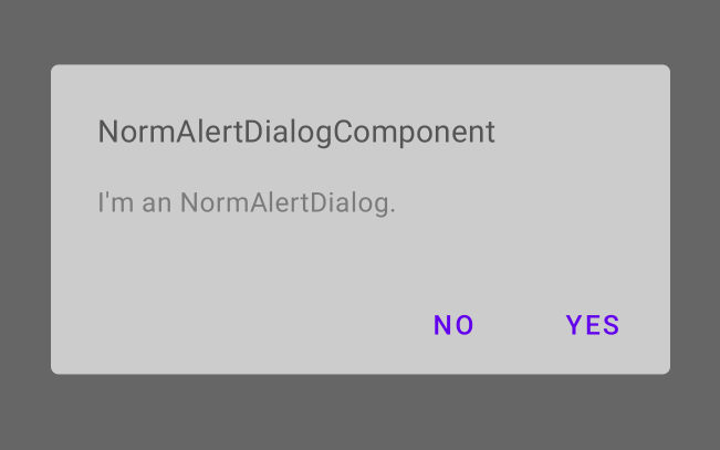
普通的提示对话框
代码实现:
@Composable
fun NormAlertDialogComponent(
    dialogState: MutableState<Boolean>
) {

    val context = LocalContext.current

    if (dialogState.value) {
        AlertDialog(
            onDismissRequest = { dialogState.value = false },
            title = { Text(text = "NormAlertDialogComponent") },
            text = { Text(text = "I'm an NormAlertDialog.") },
            confirmButton = {
                TextButton(onClick = {
                    dialogState.value = false
                    Toast.makeText(context, "Confirm Button Click", Toast.LENGTH_SHORT).show()
                }) {
                    Text(text = "YES")
                }
            },
            dismissButton = {
                TextButton(onClick = {
                    dialogState.value = false
                    Toast.makeText(context, "Dismiss Button Click", Toast.LENGTH_SHORT).show()
                }) {
                    Text(text = "NO")
                }
            },
            backgroundColor = Color.LightGray,
            contentColor = Color.DarkGray
        )
    }
}
预览效果:
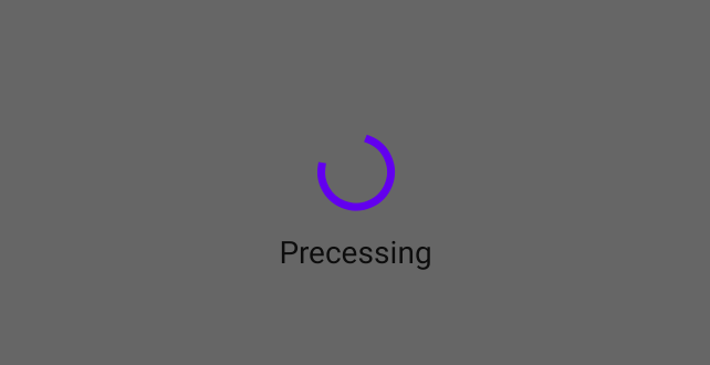
圆形无线循环进度对话框
代码实现:
@Composable
fun ProcessDialogComponent(
    dialogState: MutableState<Boolean>
) {

    if (dialogState.value) {
        Dialog(onDismissRequest = { dialogState.value = false }) {
            //圆形进度条--无限循环
            Column (
                horizontalAlignment = Alignment.CenterHorizontally
            ) {
                CircularProgressIndicator()
                Spacer(modifier = Modifier.requiredHeight(10.dp))
                Text(text = "Precessing")
            }

        }
    }
}
预览效果:
完整代码
package cn.shanyaliux.composedemo

import android.widget.Toast
import androidx.compose.foundation.layout.Column
import androidx.compose.foundation.layout.Spacer
import androidx.compose.foundation.layout.requiredHeight
import androidx.compose.foundation.layout.wrapContentSize
import androidx.compose.material.*
import androidx.compose.runtime.Composable
import androidx.compose.runtime.MutableState
import androidx.compose.runtime.mutableStateOf
import androidx.compose.runtime.remember
import androidx.compose.ui.Alignment
import androidx.compose.ui.Modifier
import androidx.compose.ui.graphics.Color
import androidx.compose.ui.platform.LocalContext
import androidx.compose.ui.unit.dp
import androidx.compose.ui.window.Dialog

@Composable
fun AlertDialogDemo() {
    val openNormAlertDialog = remember {
        mutableStateOf(false)
    }
    val openProcessDialog = remember {
        mutableStateOf(false)
    }
    NormAlertDialogComponent(
        dialogState = openNormAlertDialog
    )
    ProcessDialogComponent(
        dialogState =  openProcessDialog
    )

    Column {
        Button(
            modifier = Modifier.wrapContentSize(),
            onClick = {
                openNormAlertDialog.value = !openNormAlertDialog.value
            }
        ) {
            Text(text = "OpenNormDialog")
        }

        Button(
            modifier = Modifier.wrapContentSize(),
            onClick = {
                openProcessDialog.value = !openProcessDialog.value
            }
        ) {
            Text(text = "OpenProcessDialog")
        }
    }

}

@Composable
fun NormAlertDialogComponent(
    dialogState: MutableState<Boolean>
) {

    val context = LocalContext.current

    if (dialogState.value) {
        AlertDialog(
            onDismissRequest = { dialogState.value = false },
            title = { Text(text = "NormAlertDialogComponent") },
            text = { Text(text = "I'm an NormAlertDialog.") },
            confirmButton = {
                TextButton(onClick = {
                    dialogState.value = false
                    Toast.makeText(context, "Confirm Button Click", Toast.LENGTH_SHORT).show()
                }) {
                    Text(text = "YES")
                }
            },
            dismissButton = {
                TextButton(onClick = {
                    dialogState.value = false
                    Toast.makeText(context, "Dismiss Button Click", Toast.LENGTH_SHORT).show()
                }) {
                    Text(text = "NO")
                }
            },
            backgroundColor = Color.LightGray,
            contentColor = Color.DarkGray
        )
    }
}

@Composable
fun ProcessDialogComponent(
    dialogState: MutableState<Boolean>
) {

    if (dialogState.value) {
        Dialog(onDismissRequest = { dialogState.value = false }) {
            //圆形进度条--无限循环
            Column (
                horizontalAlignment = Alignment.CenterHorizontally
            ) {
                CircularProgressIndicator()
                Spacer(modifier = Modifier.requiredHeight(10.dp))
                Text(text = "Precessing")
            }

        }
    }
}